

Interface font
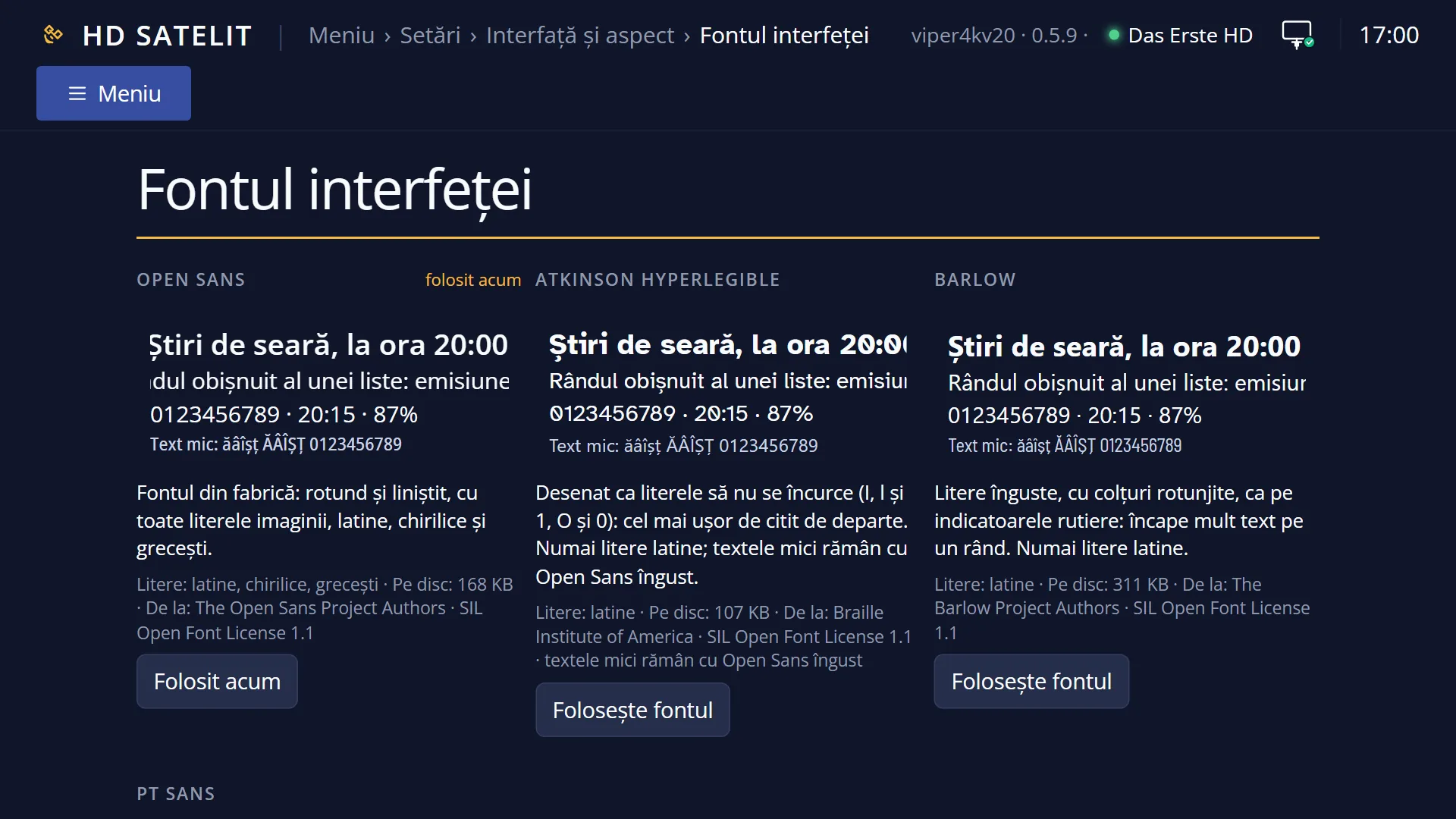
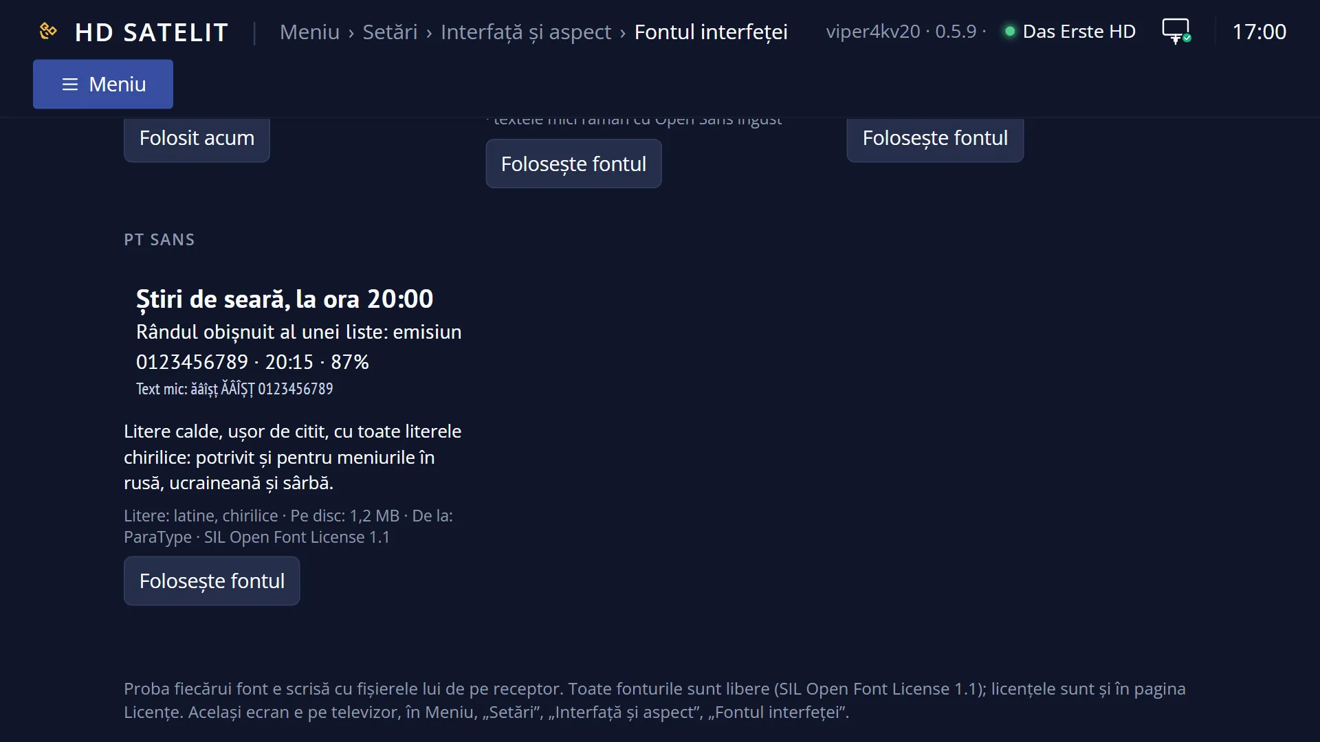
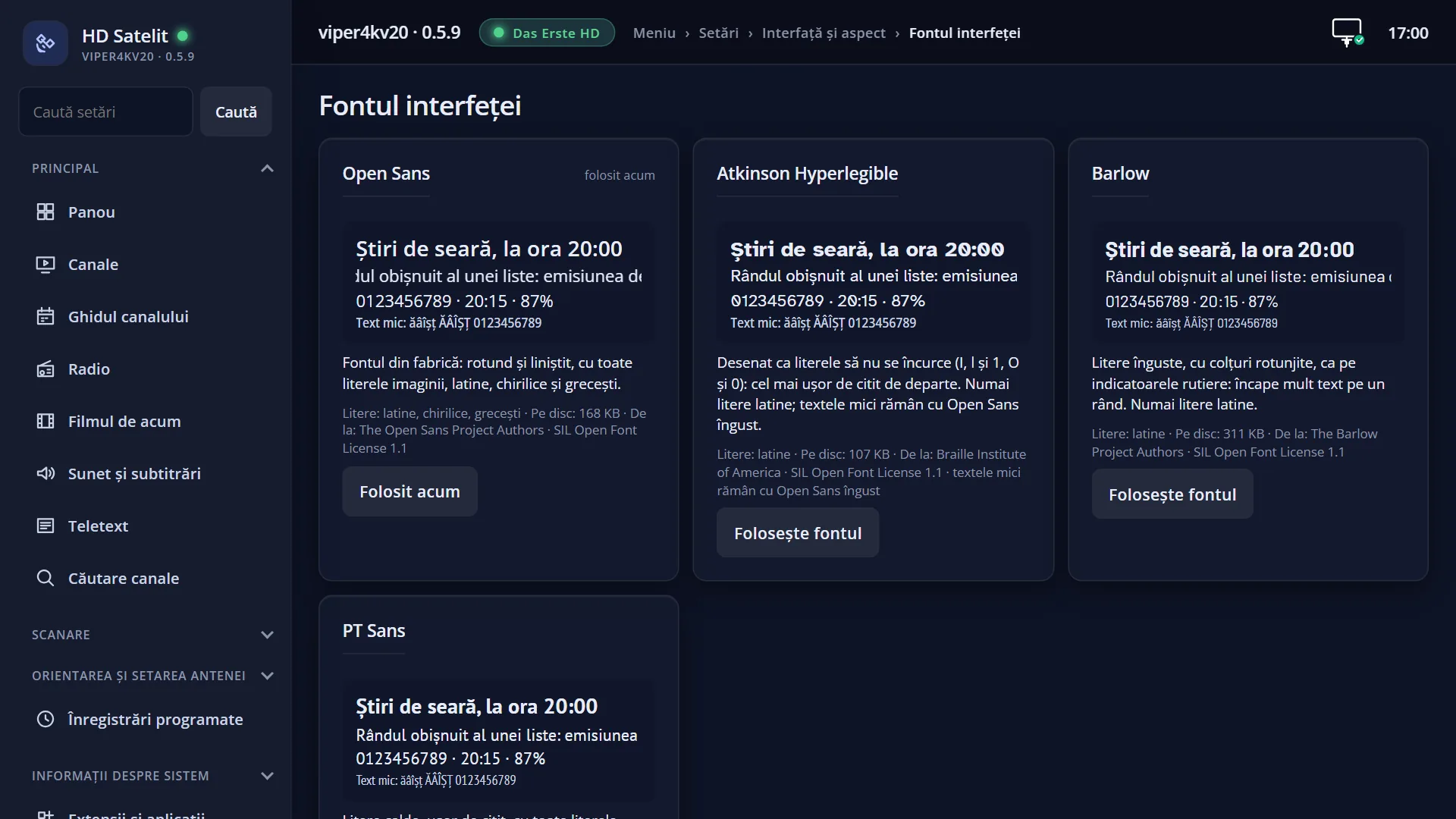
Screenshots are being added: so far 5 from the receiver and 3 from the web interface; the aim is at least 5 of each, with arrows and frames, and, where a setting changes what you see, a before and after comparison.
English screenshots coming: some of the pictures below still show the receiver and the web interface in Romanian. The rows, keys and steps described on this page are the English ones.
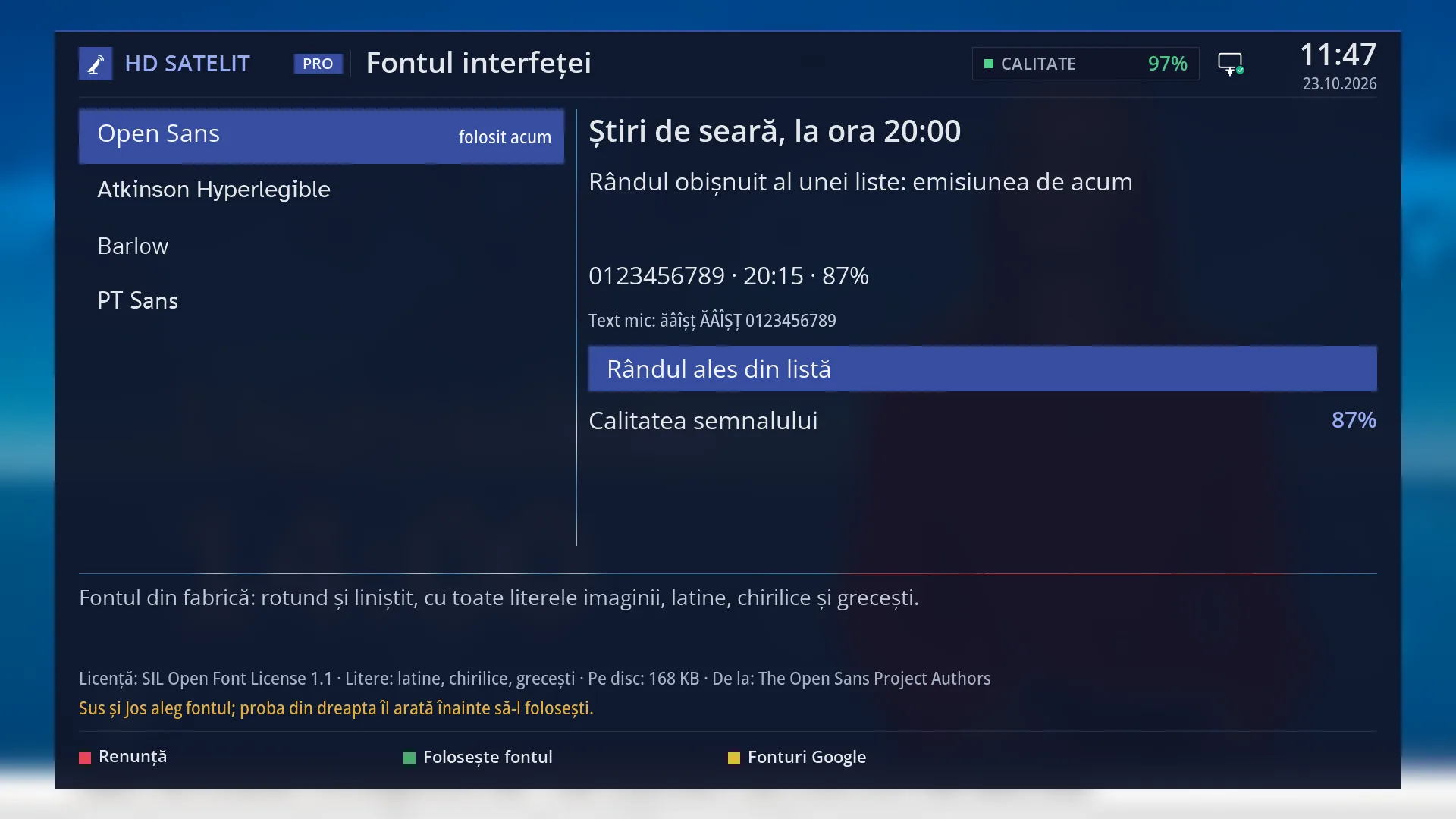
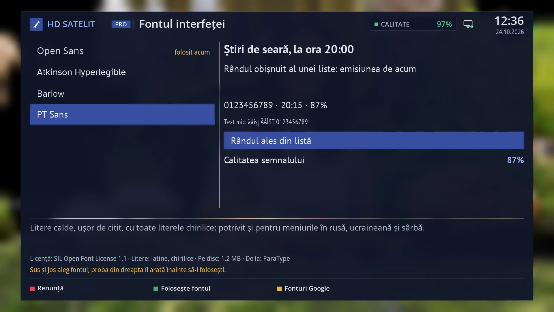
- 1 The four fonts, each name written in its own font; “in use now” shows the current font.
- 2 Sample of the font under the cursor: title, list row, digits, small text, selected row, setting with a value.
- 3 The font description.
- 4 The licence, the letters, the size on disk and the author; below, what UP and DOWN do.
- 5 RED Cancel, GREEN Use the font, YELLOW Google Fonts.
What it is for
“Interface font” sets the shape of the letters in all the receiver's menus and screens. You choose from four free fonts that come with the image: Open Sans (factory default), Atkinson Hyperlegible, Barlow and PT Sans.
Before you choose, you see a sample of the font under the cursor: a title, a list row, digits, small text with ă, â, î, ș, ț, a selected row and a setting with a value. The sample changes nothing until you press GREEN.
The chosen font is applied straight away to the screens you open from now on, and it stays after a restart. You do not change the letter size here, but in “Font Size”.
A font that does not have all the letters of the menu language (for example Atkinson Hyperlegible or Barlow when the menus are in Russian) is shown as “lacks the language letters” and cannot be chosen.
How to get here
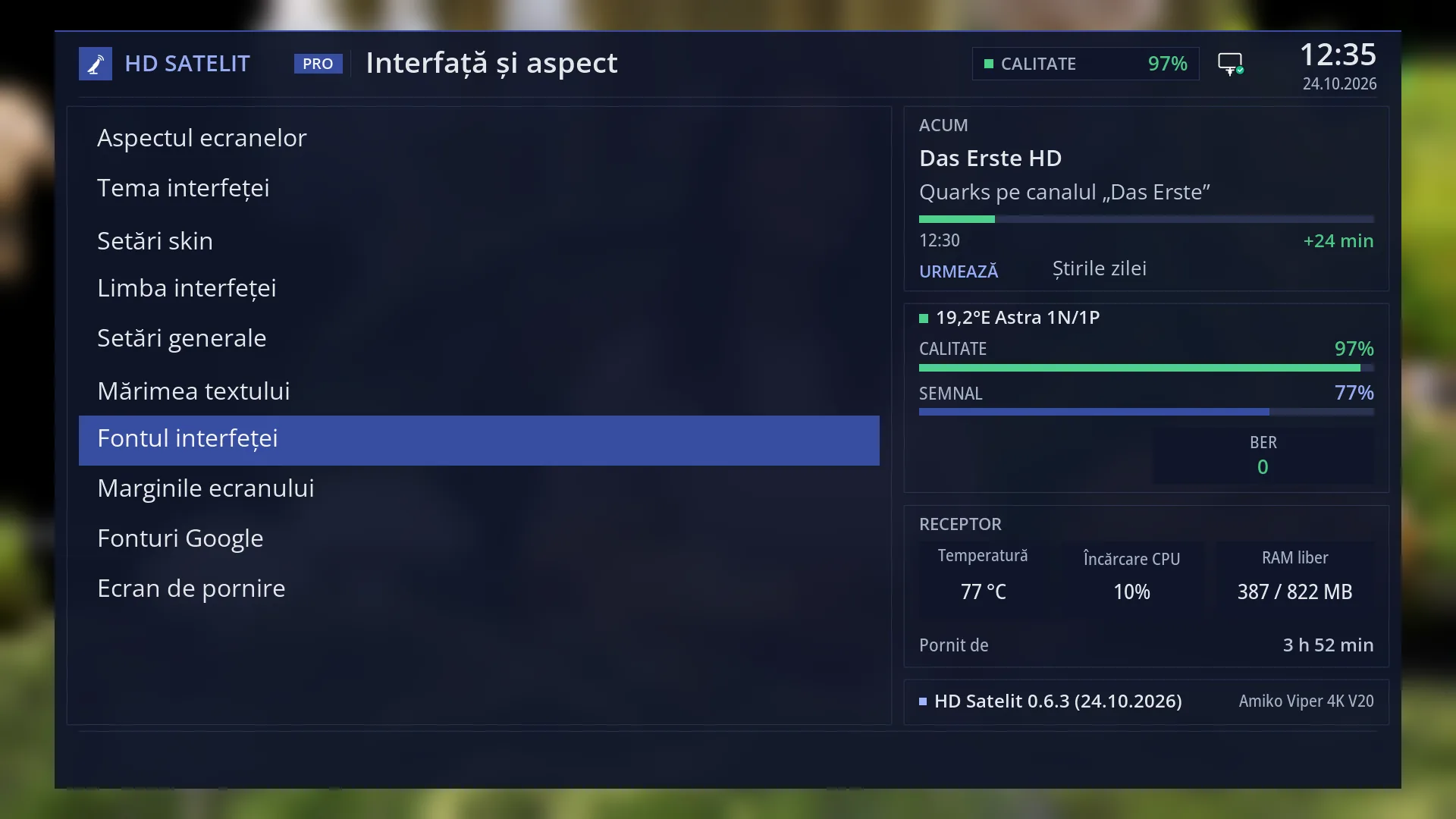
Path: Main menu > Settings > Interface & Appearance > Interface font.
Keys on the TV: MENU 6 6 7.
In the web interface: the /font-interfata page, with the same four fonts, each with its sample written using its own files on the receiver.
What you see on the screen
At the top, the title “Interface font”, the clock and the date. In the Pro theme, also “HD SATELIT” with the “PRO” label, the signal quality and the network icon.
On the left, the list of the four fonts, each name written in its own font. To the right of the name, “in use now” appears in yellow next to the current font, or “lacks the language letters” in grey next to a font that does not suit the menu language.
On the right, the sample of the font under the cursor: “Evening news at 20:00” (title), “A normal list row: the programme on now”, the digits “0123456789 · 20:15 · 87%”, “Small text: ABC abc 0123456789”, a selected row on blue and “Signal quality” with “87%”.
At the bottom, the font description (for example “The factory font: round and calm, with all the letters of the image, Latin, Cyrillic and Greek.”), then the licence, the letters it has, how much disk space it takes and the author. Below that, in yellow, “Up and Down choose the font; the preview on the right shows it before you use it.”.
Keys: RED “Cancel”, GREEN “Use the font”, YELLOW “Google Fonts”.
After GREEN, the message “The interface font is now ... Screens you open from now on use it; the menu behind changes when you open it again.” appears and closes by itself after 8 seconds.
Rows and settings
| Row | Values | Default | What it does |
|---|---|---|---|
| Open Sans | in use now (factory default) | The factory font: round and calm, with all the letters of the image, Latin, Cyrillic and Greek. It also has a narrow version for small text. Choose it to go back to the factory look. | |
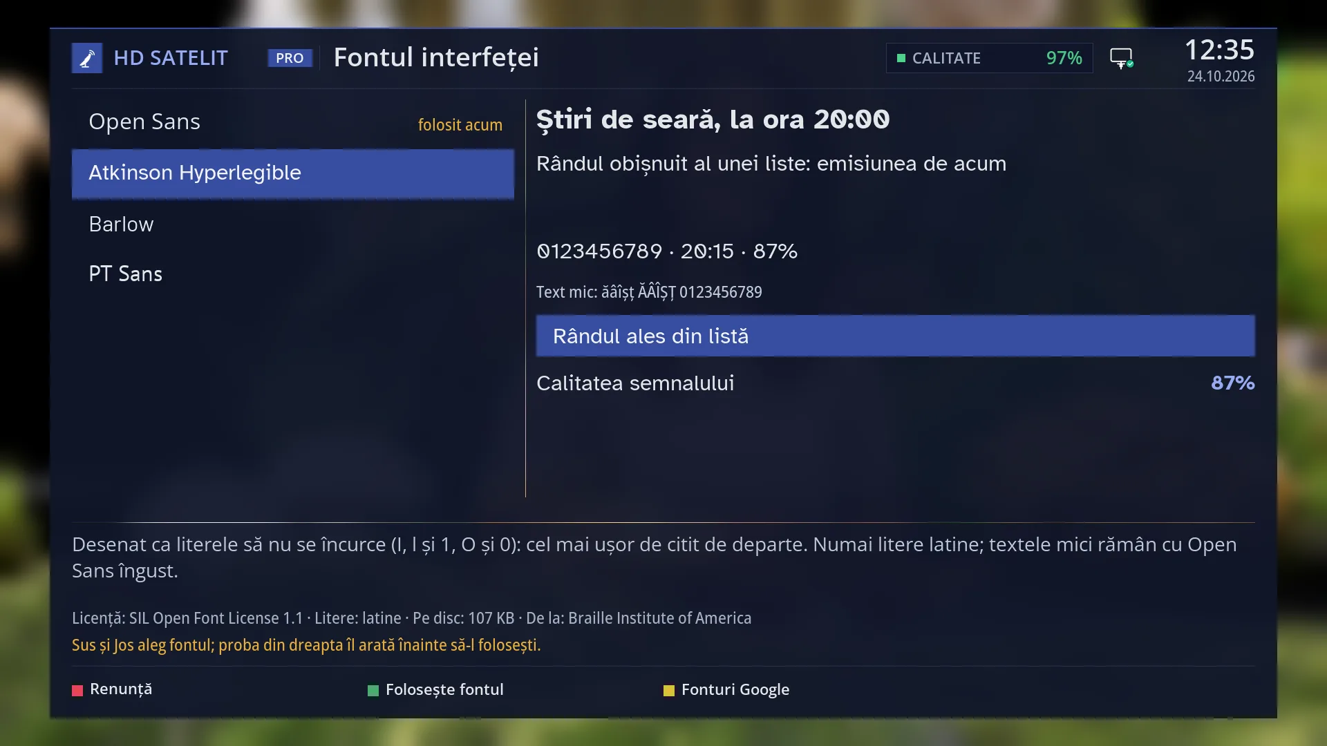
| Atkinson Hyperlegible | Designed so that letters are not confused (I, l and 1, O and 0): the easiest to read from a distance. Latin letters only; small text stays in narrow Open Sans. When you find the menus hard to read from the sofa or your eyesight is poor. | ||
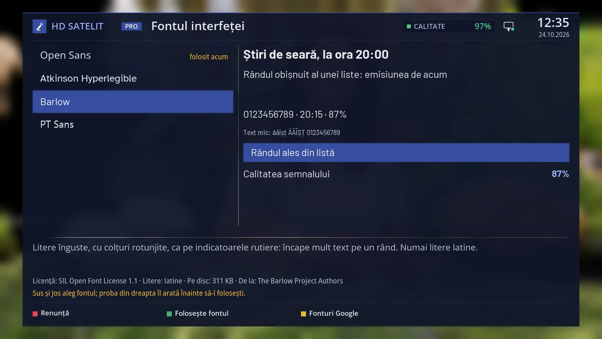
| Barlow | Narrow letters with rounded corners, like on road signs: a lot of text fits on one row. Latin letters only. When you want more text to fit on the rows, for example long programme names. | ||
| PT Sans | Warm, easy-to-read letters, with all the Cyrillic letters: also suitable for menus in Russian, Ukrainian and Serbian. When you want a warmer font than Open Sans or the menus are in Russian. |
Keys
| UP / DOWN | Moves the cursor to another font; the sample on the right and the description at the bottom change straight away. |
| GREEN (Use the font) / OK | Applies the chosen font straight away and remembers it. On the font in use now, OK only closes the screen. |
| RED (Cancel) / EXIT | Closes the screen without changing the font. |
| YELLOW (Google Fonts) | Opens “Google Fonts”, where you download other free fonts; those are used for subtitles, not for menus. |
Step by step
Making the menus easier to read from a distance
- Press MENU 6 6 7.
- Move the cursor to “Atkinson Hyperlegible” and look at the sample on the right.
- Press GREEN. Leave the menu with MENU and open it again: everything is written in the new font.
- If the letters look small to you, make them bigger in “Font Size” (MENU 6 6 6).
Going back to the factory font
- Press MENU 6 6 7.
- Move the cursor to “Open Sans” and press GREEN.
Problems and solutions
I chose a font, but the menu behind still has the old letters.
The font is applied to screens opened from now on. Close the menu with MENU and open it again.
Next to a font it says “lacks the language letters”, and GREEN shows “This font does not have all the letters of the menu language.”.
The font does not have all the letters of the language the menus are in (for example the Cyrillic letters for Russian). Choose Open Sans or PT Sans, which have them.
Small text looks different from the rest.
Atkinson Hyperlegible has no narrow version, so small text stays in narrow Open Sans.
I cannot find the font I downloaded from “Google Fonts” in the list.
Downloaded fonts are used for subtitles (Subtitle appearance, the “Font” row), not for menus. For menus there are only the four fonts that come with the image.
“A file of the font is missing.” or “A file of the font is damaged.” appears.
The font files on the receiver are incomplete. The receiver keeps the current font; choose another one. An image update puts the files back.
The letters are too small or too big.
You do not change the size here. Use “Font Size” in the same submenu.
Related topics
- Font Size
- Google Fonts
- Subtitle appearance (the subtitle font)
- System Language
- Interface & Appearance (the submenu)
- Licenses
- Matching web page: /font-interfata.